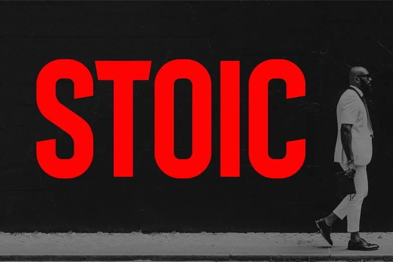
About Stoic Font
Stoic Font feels like a calm voice that still carries real strength. When we first tested this typeface, we noticed how it holds the page with quiet power, rather than shouting for attention. It looks solid and clear, so every word feels steady and sure.
In our review work at Dafontvault, we look for fonts that support strong stories. This one stood out because it balances a bold presence with easy reading. The letters feel grounded, almost like carved shapes on a stone monument, which gives designs a focused and confident mood.
Font Style & Design Analysis
Stoic Font is best viewed as a bold display font, built for headlines and titles rather than long text. The overall typography style leans modern but not cold. It has clean shapes, sturdy forms, and a simple structure that works well for short, sharp messages.
The designer is currently unknown, but the design choices feel very intentional. Each letterform sits with strong posture, as if every stroke has a clear purpose. Because of this, the font family gives layouts a sense of order and discipline, which suits brands that value clarity and focus.
We noticed a firm rhythm in the spacing between letters. The proportions are tight enough to create impact, yet open enough for legibility in short text. This makes the font style feel attention-grabbing without becoming cluttered. Used well, it sets a serious, confident mood that still feels accessible.
Where Can You Use Stoic Font?
Stoic Font works best where you need strong headlines and bold titles. Think posters, book covers, hero images on websites, or opening slides for key presentations. It suits projects that need impact at a glance, especially when you want the message to feel firm and grounded.
Because of its display nature, this typeface shines at larger sizes. At big scales, the sturdy letterforms really show their shape and strength. That said, it can still handle short labels, buttons, and UI titles if you give it enough space. For long paragraphs, a lighter companion font is usually a better fit.
Brands with a serious or focused tone gain a lot from this font style. It can support visual identity work for consultants, tech firms, fitness brands, or educational platforms that want a bold presence. Used on posters or social media graphics, it helps statements land with weight and confidence.
Font License
Licensing for Stoic Font can differ between sources. Many designers allow personal use for free but require a paid licence for business work. Always read the official licence details carefully before using the typeface in commercial projects, client branding, or any paid design.


