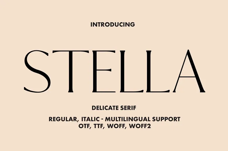
About Stella Serif Font
Stella Serif Font feels like a calm, classic voice on the page. When we first tested it in mock book covers and simple brand layouts, its gentle serifs and clear shapes made every word feel steady and confident. It brings a quiet charm that many modern typefaces miss.
During our review sessions at Dafontvault, we noticed how well it holds structure without looking stiff. The letters sit together with a smooth rhythm, which makes reading easy. Because of this, it stood out as a solid choice for long text, but also for stylish titles that need a touch of heritage.
Font Style & Design Analysis
Stella Serif Font belongs to the serif family, with a style that leans towards an editorial feel. It looks well suited for print clarity and more classic layouts. The designer is currently unknown, yet the craft suggests a careful hand that understands balance and contrast in traditional letterforms.
The serifs are modest, not too sharp and not too soft. Each character has enough contrast between thick and thin strokes to feel elegant, while still staying strong on the page. That said, nothing about the typeface feels fussy. The overall mood is calm, readable, and slightly bookish.
Spacing plays a key role in its appeal. The default letter spacing feels open enough for paragraphs, but tight enough to keep headlines compact and tidy. As a result, the font style carries a subtle heritage tone, making it ideal for editorial layouts, refined branding concepts, and titles that need a classic, trustworthy presence.
Where Can You Use Stella Serif Font?
Stella Serif Font works well in many settings where words must feel serious yet welcoming. We see it fitting nicely on book covers, printed brochures, and thoughtful blog posts. Because of its classic serif structure, it supports long reading sessions without eye strain and keeps the page looking organised.
In branding work, this typeface can shape a strong visual identity for law firms, consultancies, heritage hotels, or artisan food labels. Its editorial tone also suits magazines and newsletters. Used for section titles and pull quotes, it delivers enough impact while still matching the body text with ease.
On screens, the font handles medium and large sizes best. Short text blocks, about pages, and article headers benefit most. For that reason, it shines as a display font for headings paired with a simple sans-serif for UI or captions. Readers who enjoy traditional, book-like typography will warm to its classic charm.
Font License
Before using Stella Serif Font, always check the official licence details. Many serif fonts allow free personal use, but commercial projects often need a paid or extended licence. To stay safe, review the creator’s terms carefully and confirm that your branding, print, or client work is fully covered.


