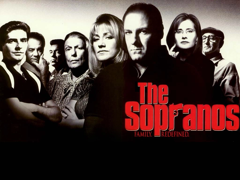
About Sopranos Font
Sopranos Font feels like a bold nod to classic TV crime drama. When we first looked at this typeface, the sharp shapes and strong letters jumped out at once. It has the same tough mood as the famous show logo, with a heavy, attention-grabbing style that fills any space.
After testing it in mock posters and title cards, we saw how quickly it set the scene. The dark, dramatic feeling comes through even in short text. That mix of style and impact is what made it stand out to us at Dafontvault, especially for projects that need instant tension and mood.
Font Style & Design Analysis
Sopranos Font works mainly as a bold display font with a strong headline look. The exact designer is designer unknown, but the design clearly follows the famous crime-series title. It aims for bold presence and quick impact rather than long reading blocks or tiny UI labels.
The overall typography has thick strokes, tight spacing, and simple shapes. The letterforms stay clear and firm, so each character feels heavy and grounded. Because of this, the typeface gives off a dramatic, almost cinematic air, ideal for thriller themes, gritty posters, and bold titles that sit front and centre.
The rhythm between letters is compact, so words form solid blocks of black on the page. That creates strong contrast against light backgrounds. In practice, this font style works best with short text, such as logos, headers, and poster titles, where its impact can shine without tiring the eye.
Where Can You Use Sopranos Font?
Sopranos Font suits projects that need drama and suspense. Think movie posters, crime podcast covers, thriller book titles, or streaming thumbnails. Its headline energy and bold presence make it perfect for attention-grabbing graphics where you want viewers to feel tension before they even read the words.
Because the typeface is so heavy, it performs best at medium to large sizes. On posters and banners, the strong letterforms hold up well from a distance. That said, in small captions or body text it can feel cramped. For that reason, we suggest pairing it with a simpler supporting font family for longer copy.
This font style can also work in branding for edgy shows, underground events, or entertainment logos that lean into a dark, thriller mood. Designers making social media teasers, spooky posters, or dramatic title cards will find it useful. Used in short bursts, it adds a clear visual identity and sets a serious, cinematic tone.
Font License
Always check the licence terms before using Sopranos Font in any project. Some versions allow free personal use, like school work or home designs, but commercial work such as client branding or paid products may need a paid or special licence. Please review the official licence from the source each time.


