About Seinfeld Font
The Seinfeld Font feels like pure 90s television energy turned into letters. It takes that bold sitcom logo style and turns it into a usable display typeface for modern projects. When we tested it in mock posters and title cards, it instantly gave scenes a fun, recognisable mood.
This font stands out because it mixes comedy charm with strong, clear letterforms. The shapes look big and confident, so they hold attention even from far away. At Dafontvault, we love how it captures the show’s lively spirit without feeling dated or fake. It keeps that pop culture edge while still working in real design work.
Font Style & Design Analysis
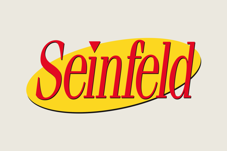
The Seinfeld Font works as a bold display typeface with a clear headline focus. It leans on strong curves and a dramatic arc, echoing the logo from the classic TV series. The exact origin is a fan-made interpretation, with the designer unknown, but the style follows that famous title treatment very closely.
As a display font, it brings instant impact. The letters have a smooth flow and a tight rhythm that suits short text and quick reads. Spacing feels snug but not cramped, so the words form one strong visual block. That bold presence makes it ideal for posters, banners, and attention-grabbing titles.
The strokes sit between playful and confident, with rounded curves and clean edges. Because of this, the mood feels upbeat rather than serious. The overall typography effect works best in bright colours and layered layouts, much like TV show graphics. Used in moderation, it can anchor a whole visual identity around humour and nostalgia.
Where Can You Use Seinfeld Font?
The Seinfeld Font shines in any project that needs a loud, TV-style headline. Think show posters, comedy club flyers, retro streaming thumbnails, or podcast covers. It also suits logos for media brands that want a playful tone. In short text, it delivers maximum impact with very few words.
On screens, the font holds up well at larger sizes, such as YouTube thumbnails or social media graphics. That said, the shapes are too bold for long blocks of copy. In practice, it works best as a title font paired with a simpler typeface for body text. This pairing keeps legibility strong while letting the display font do the shouting.
For youth events, pop-culture blogs, or fan projects, this typeface can set a fun mood fast. It also fits parody graphics and meme-style layouts that echo sitcom vibes. Use it on posters, banners, or web headers when you want laughter and energy to jump off the page and grab your audience.
Font License
The Seinfeld Font may have different terms for personal and commercial use, depending on the source. Always read the official licence before using it in client work, products, or paid projects. For that reason, check the original provider’s licence details to stay safe and fully compliant.


