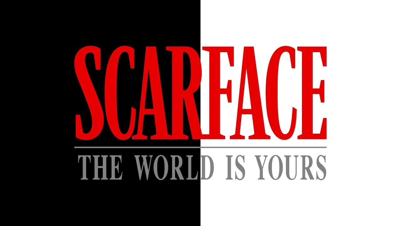
About Scarface Font
Scarface Font brings the bold crime-drama energy of the classic film straight into your designs. When we first tested this typeface, we focused on how it behaved in strong, simple layouts. Because of this, we quickly saw how easily it grabs attention without becoming messy or hard to read.
During our review here at Dafontvault, we explored how the letterforms worked in poster-style compositions and short titles. The typeface stood out for its sharp contrast and confident shapes. It feels dramatic, but still controlled, which makes it perfect for powerful headlines and striking visual identity work.
Font Style & Design Analysis
Scarface Font is best described as a bold display font with a cinematic flavour. The designer is currently unknown, yet the style clearly echoes classic gangster movie posters and vintage crime artwork. As a display typeface, it is built for impact, not long reading, and it shines in short text settings.
The letterforms use strong verticals and tight spacing to build tension on the page. In practice, this creates an immediate headline punch that feels almost like a movie title. The rhythm between letters is compact, which supports poster layouts and dramatic titles where every word must hit hard.
There is a subtle retro edge as well, with hints of period style and grainy posters from the 70s and 80s. This mood gives designs a throwback feel without looking dated. As a result, the font style works beautifully for artwork that needs drama, nostalgia, and a bold presence all at once.
Where Can You Use Scarface Font?
Scarface Font works best in projects where you need instant impact. Think film posters, thriller book covers, album art, and bold branding concepts. Because it behaves like a strong display font, it suits logos, titles, and large typographic statements more than long blocks of body text.
At big sizes, the details of each character shine, giving headlines weight and authority. On smaller text, the tight spacing can feel heavy, so we suggest using it mainly for short words or phrases. Pair it with a calmer serif or sans serif font family for supporting paragraphs and captions.
This typeface speaks to audiences who enjoy drama, crime stories, and bold visual storytelling. It fits gaming graphics, crime podcast covers, gritty streetwear branding, and attention-grabbing social media posters. Used with care, it can anchor a full visual identity and make your typography feel fearless and cinematic.
Font License
Licensing for Scarface Font can differ between sources, so always check carefully. Many versions allow free personal use, while commercial projects often need a paid licence. Before using it for client work, products, or large branding, read the official licence terms to stay fully compliant.


