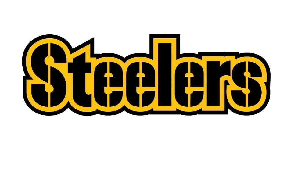
About Pittsburgh Steelers Font
The Steelers Font feels like game day energy frozen in strong letters. When we first tested it, the bold look and sharp edges jumped out at us right away. It has the same proud spirit people connect with the team, and it gives any layout an instant sense of strength.
In our review work at Dafontvault, we look for typefaces that carry real character, not just style. This one stands out because every letterform feels ready for a headline, poster, or banner. It is built for attention-grabbing use, and it holds that bold presence even in simple, clean designs.
Font Style & Design Analysis
The Steelers Font sits firmly in the display font category. It is made for short text, big titles, and high-impact layouts. As far as we can tell, the designer is unknown, but the typeface clearly takes cues from classic American sports lettering and strong, geometric shapes.
Each character carries heavy strokes and tight forms that give a sense of power and unity. The proportions feel wide and confident, which helps it work well on posters and jersey-style graphics. Because of this weight, the rhythm of the text feels solid and steady, like a firm block of type on the page.
Spacing is compact, so lines of text look dense and focused rather than loose. That said, the letterforms keep enough clarity to remain readable at medium sizes. The overall mood is tough, competitive, and energetic, which suits sports branding, fan art, and any visual identity that needs a bold presence.
Where Can You Use Steelers Font?
The Pittsburgh Steelers Font style is ideal for sports-themed branding, fan posters, signs, and bold social media graphics. It shines in headline roles, where impact matters more than long reading. Use it for team slogans, scoreboards, and strong titles that need to grab attention from a distance.
On large formats, such as banners or big digital screens, the heavy strokes and strong shapes hold up very well. At smaller sizes, it still works for short labels or UI buttons, but it is not suited for long paragraphs. For that reason, we suggest pairing it with a simpler supporting font family for body text.
Designers working on merch, album-style covers, or dramatic poster layouts will enjoy the punch this typeface brings. The Pittsburgh Steelers Font look also fits gaming streams, YouTube thumbnails, and bold branding for clubs or sports bars. In practice, any project that needs a tough, competitive edge can benefit from this striking font style.
Font License
Always check how you are allowed to use the Steelers Font before starting a project. Some versions may be free for personal work only, while commercial use often needs a paid licence. Make sure you read the official licence details from the source to stay fully compliant.


