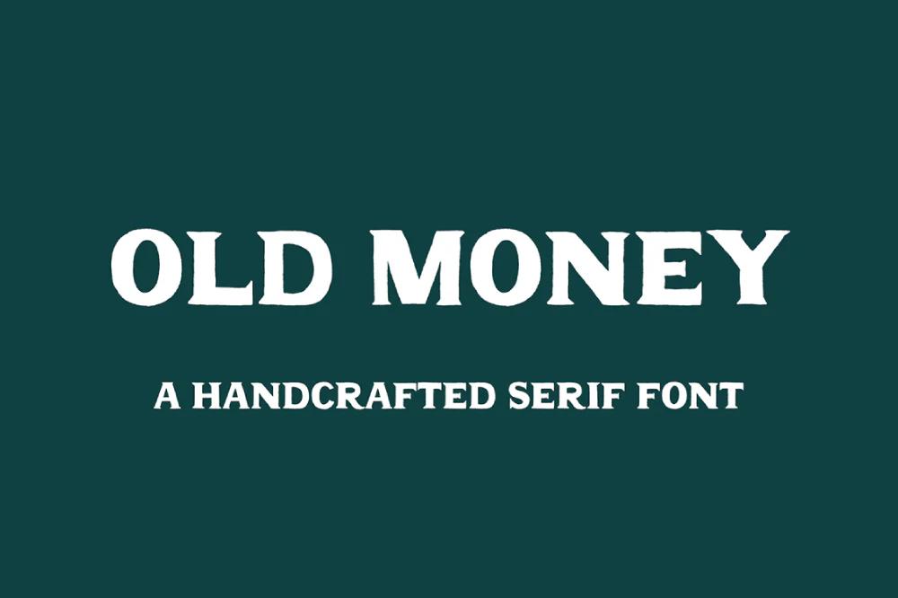
About Old Money Font
Old Money Font feels like stepping into a quiet, wood-panelled library. The letters carry a calm, premium mood that suits careful, confident design. When we first tested it in mock brand layouts, the typeface gave even simple words a strong sense of heritage and quiet authority.
In our review sessions at Dafontvault, we tried it in both light and dark colour schemes. It held its own each time. Because of this steady character, it stood out from louder display fonts. It does not shout; instead, it adds refined weight and a high-end finish to almost any headline.
Font Style & Design Analysis
Old Money Font works best as a luxury display font with a minimal, elegant flavour. It leans into a high-end, editorial look rather than playful or casual vibes. The designer is unknown, but the design choices feel considered, with a focus on premium style and clean spacing.
The letterforms show a refined rhythm, with balanced proportions and gentle contrast between thick and thin strokes. Each shape feels deliberate. As a result, the font style delivers quiet confidence instead of drama. The spacing supports strong legibility in short text, which makes it ideal for bold presence in headlines and titles.
When we look closely at the typography, we notice how the curves meet the straight lines with smooth control. This gives the typeface a polished, high-end mood. It looks tailored for fashion branding, beauty brands, or any visual identity that needs a premium feel without heavy ornament or fuss.
Where Can You Use Old Money Font?
Old Money Font shines in branding work where style and status matter. Think fashion labels, boutique hotels, jewellery brands, and refined packaging. Used in logos, wordmarks, and key headlines, it brings an elegant, high-end tone that pairs well with soft colour palettes and spacious layouts.
This display font performs best at medium to large sizes. In posters, magazine covers, and website hero sections, its bold presence becomes clear. That said, it can still support shorter text lines on print materials, such as business cards, menus, and labels, as long as you keep copy brief and give it room to breathe.
For digital projects, we like it in landing page titles, luxury product banners, and clean social media graphics. It suits audiences who expect a refined, premium experience rather than loud trends. Used with simple backgrounds and good hierarchy, the typeface can anchor a whole visual identity with very little extra decoration.
Font License
Before you use Old Money Font, always check the official licence terms. Many fonts allow free personal use but require a paid or special licence for commercial projects. For that reason, review the creator’s licence carefully so your branding, client work, or products stay fully compliant.


