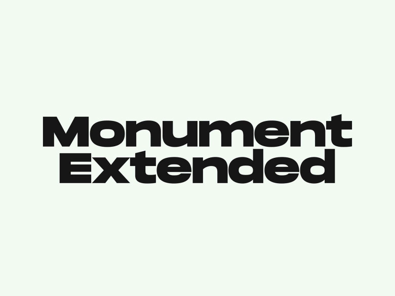
About Monument Extended Font
When we first tested Monument Extended Font, it felt like standing in front of a huge city billboard. The letters hit you with bold presence and strong shape. This display typeface does not whisper. It speaks loud and clear, even in very short text.
We explored it across mock posters, web banners, and brand titles, and it kept pulling our eyes back. The extra-wide letterforms create a solid, confident mood that suits modern design work. Because of this, it quickly became a reference point for us at Dafontvault when we study big, attention-grabbing headline styles.
Font Style & Design Analysis
Monument Extended Font is a strong display typeface with an extended width and a modern, almost architectural feel. It looks like a sans-serif at heart, with clean lines and simple shapes, but stretched to give more impact. This mix makes it ideal for headline work and bold titles that need maximum visibility.
The exact creator is often credited to the independent studio Dinamo Typefaces, who are known for experimental and striking type design. In this font family, they push width and weight together, so every character feels like a constructed block. That said, the rhythm still feels balanced and deliberate.
Spacing is tight but controlled, which helps words form a solid bar of colour on the page or screen. In practice, this creates a strong visual identity with very high legibility in large sizes. The mood leans powerful, urban, and contemporary, giving your typography a confident, attention-grabbing edge for posters and bold branding.
Where Can You Use Monument Extended Font?
Because of its wide stance and heavy style, Monument Extended Font shines in headline roles. Think posters, album covers, bold website hero sections, and campaign titles. It works well on digital screens and print, especially when you keep the text short and let the size do the talking.
We found it especially strong for branding projects that want a modern, minimal yet impactful look. Tech products, streetwear labels, creative agencies, and event identities all benefit from its bold presence. Used on packaging or large signage, it creates a clean, screen-friendly statement that people remember.
At smaller sizes, the heavy extended letterforms can feel crowded, so it is better for big titles than long paragraphs. Pair it with a simpler sans-serif typeface for body copy to keep everything readable. For that reason, designers often use it as a display accent within a wider typography system for campaigns and visual identity work.
Font License
Like most professional typefaces, Monument Extended Font usually comes with different licences for personal and commercial use. Always read the official licence from the original source before using it in client work, apps, or products, and make sure your usage, team size, and media are all properly covered.


