About Metalica Font
Metalica Font feels built for loud moments. When we first tested it, the letters almost leapt off the screen, with a bold presence that suits rock themes and dramatic titles. It has a sharp, edgy voice, so every word looks confident, strong, and ready to grab attention.
During our review sessions at Dafontvault, we tried this typeface across different layouts and colours. It stood out most on dark backgrounds and high-contrast designs. Because of this, it quickly became a go-to choice in our toolkit when we needed something striking, heavy, and full of visual energy.
Font Style & Design Analysis
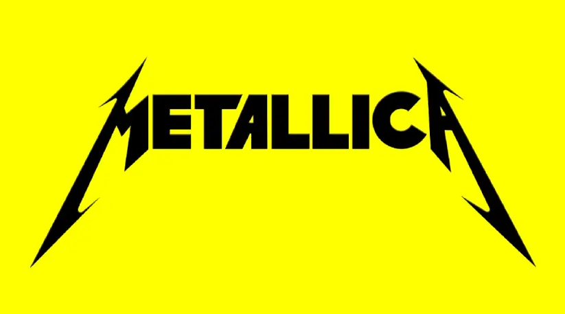
We would class Metalica Font as a bold display font with a clear heavy-metal attitude. The font style draws on sharp angles and pointed strokes that echo classic rock and metal album art. The designer is unknown, but the influence of iconic band logos and poster lettering is hard to miss.
The letterforms carry a strong rhythm, with dramatic peaks and edges that create an intense, almost aggressive mood. Strokes are thick and forceful, giving each character serious weight on the page. That said, the inner spaces stay open enough to keep short words readable, especially in big headline settings.
Spacing feels tight and compact, which adds to the pressure and energy of the typeface. Because of this, Metalica Font works best in short text, such as titles and slogans. It is not made for body copy, but for impact, power, and a dramatic, almost medieval rock aesthetic.
Where Can You Use Metalica Font?
Metalica Font shines in projects that need drama and punch. Think album covers, band logos, festival posters, and bold event titles. It fits especially well with rock, metal, gaming, and fantasy themes. Use it when you want artwork to feel intense, edgy, and impossible to ignore.
In practice, the typeface performs best at large sizes where its ornate shapes and sharp angles have room to breathe. As a result, it works for posters, banners, merchandise prints, and social media graphics. On screens, it adds an attention-grabbing headline style, but it should stay away from tiny UI labels or long paragraphs.
Designers can pair this typeface with a simple sans-serif or clean serif for supporting text. That mix helps balance legibility with style. It suits teen and adult audiences, especially fans of heavy music, gaming culture, or dark fantasy art who enjoy a strong, dramatic visual identity.
Font License
Licensing for Metalica Font can change between sources, so always read the official terms. Many fonts allow free personal use but need a paid licence for commercial projects. Before using it on products, logos, or client work, check the current licence details from the original distributor.


