About March Font
March Font feels like a bold announcement. It has the energy of a strong headline, with shapes that jump off the page. When we tested it in mock posters and cover layouts, it instantly pulled the eye and gave every design a clear centre of attention.
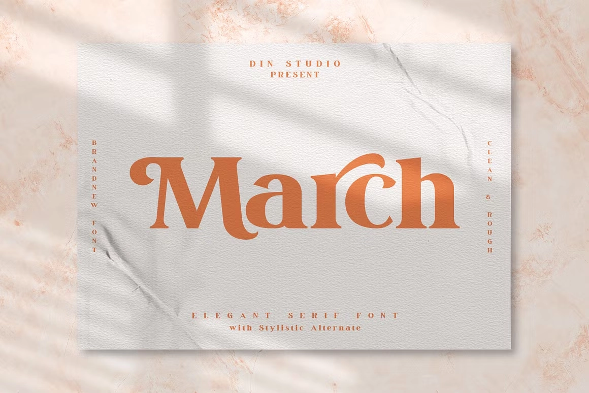
This display typeface stood out for its confident weight and sharp curves. It has a bold presence, but it still reads clearly in short text. Here at Dafontvault, we noticed how its letters hold together as a group, which makes it ideal for titles that need real impact and personality.
Font Style & Design Analysis
March Font works best as a display font. Its shapes feel built for posters, banners, and big titles rather than long reading lines. We would class it firmly in the display category, with a focus on impact and strong, attention-grabbing letterforms that suit bold visual identity work.
The designer of this typeface is currently designer unknown, but the craft in its structure is clear. The strokes are thick and confident, with sturdy verticals and tight curves. Because of this strong build, each character feels solid on the page, giving a sense of strength and control.
The rhythm between letters is compact, which helps words look powerful and united. Spacing leans slightly tight, adding tension that works well for headlines and short titles. The mood is assertive and modern, with a touch of drama that fits posters, product names, and any layout that needs visual punch.
Where Can You Use March Font?
March Font is ideal for projects where you need instant impact. Think posters, album covers, event flyers, banners, and bold branding. It shines in short text, like titles, taglines, and logo-style wordmarks, where its display style can carry the whole design without extra decoration or effects.
At large sizes, this typeface delivers strong, clear shapes that stay crisp in print and on screen. In practice, it works best when you let it breathe with good margins and simple backgrounds. Smaller sizes are possible for subheadings, but we would avoid using it for long paragraphs or dense body text.
This font family suits creative businesses, sports teams, streetwear labels, and entertainment brands that need a bold presence. It also fits campaign graphics, attention-grabbing social media posts, and headline layouts on web pages. For kids’ projects or soft themes, it may feel too strong, but for confident, loud messaging, it is a perfect fit.
Font License
Before you use March Font, always check the official licence terms. Many typefaces allow free personal use but need a paid or separate licence for commercial projects. For that reason, confirm usage rights on the original source, especially for client work, products, or large branding campaigns.


