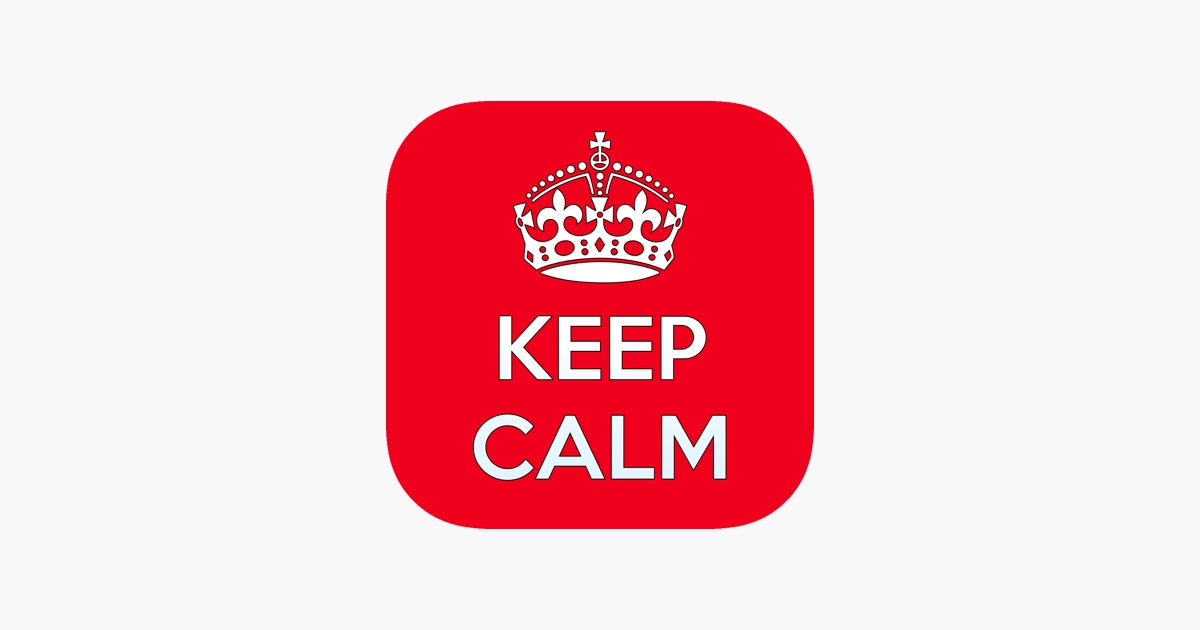
About Keep Calm Font
We have seen a lot of display fonts, but the Keep Calm Font always makes us pause. It feels simple at first glance, yet it has a bold presence that works in so many layouts. When we tested it in mock posters and banners, it held attention without feeling loud or messy.
This typeface grew from the famous “Keep Calm and Carry On” poster, and that heritage shows in its steady voice. In our trials at Dafontvault, it stayed readable in bright colours and busy backgrounds. Because of this, it quickly became a go-to pick for short text and punchy titles.
Font Style & Design Analysis
The Keep Calm Font sits firmly in the display font category, but it borrows a lot from neat sans-serif forms. The designer is widely credited as K-Type, who shaped it to echo the original wartime poster heading. As a result, it balances history with a fresh, modern feel.
Its letterforms have clean lines and a strong geometric touch, yet nothing feels cold. The strokes keep even weight, so there is no harsh contrast from thick to thin. This gives the typeface a calm rhythm on the page. Spacing between letters is open, which boosts legibility in posters and digital graphics.
The x-height feels generous, so capitals and lowercase work well together in compact headlines. Curves on letters like “C” and “O” look smooth and steady, which softens the overall mood. That said, the squared edges on some shapes keep enough structure for branding and simple UI labels.
Where Can You Use Keep Calm Font?
The Keep Calm Font shines in headline roles. It suits posters, social media graphics, banners, and short taglines where you need instant impact. Because it comes from such a famous slogan, it brings a built-in story to your visual identity, especially for campaigns that want a reassuring, confident tone.
In practice, this font style works best at medium to large sizes. At big scales, every curve looks crisp and attention-grabbing. It stays clear on screens and in print, so you can use it on flyers, mugs, T-shirts, and simple packaging. For long paragraphs, though, we would pair it with a softer text font family.
Brands that lean on nostalgia, positivity, or public messages can use this typeface to great effect. Charity events, school posters, and community projects gain a friendly, steady voice from it. It also suits light-hearted meme graphics, headline slides, and short titles in YouTube thumbnails where a quick, bold statement matters.
Font License
Licensing for the Keep Calm Font can differ between sources, so always read the official terms. Many versions allow free personal use, but commercial projects usually need a paid licence. Before you use it in client work, products, or branding, check the current licence details with the rights holder.


