About Heavitas Font
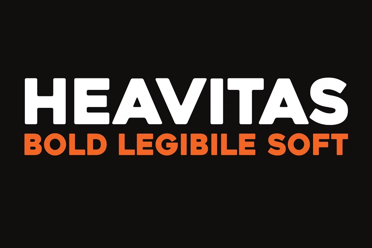
Heavitas Font is one of those big, confident typefaces that you notice right away. It feels loud, strong, and ready for the spotlight. When we first tested it in bold headlines and short titles, the chunky shapes and tight rhythm gave every layout a real sense of impact and energy.
During our review at Dafontvault, we liked how this display font keeps things simple but still looks powerful. The heavy letterforms create a bold presence without feeling messy or hard to read. Because of this balance, it quickly stood out as a smart choice for eye-catching posters and strong visual identity work.
Font Style & Design Analysis
Heavitas Font is a solid, geometric display typeface with a clear focus on impact. It sits firmly in the headline and poster world, where big shapes rule. The style is blocky and confident, with simple forms that feel modern and direct. It is built for short text, not long reading.
The designer is widely credited as Deepak Dogra, who shaped the font with strong geometry and heavy weight in mind. That said, if you find a version elsewhere, it may list the designer differently, so treat unknown sources with care. In practice, the font behaves like a bold, no-nonsense tool for attention-grabbing layout work.
The letterforms have thick strokes, tight spacing, and very little contrast, which helps each word form a solid block of colour. This creates a powerful mood, ideal for posters, covers, and logo experiments. Because of its weight, the typeface feels assertive and loud, turning even simple titles into strong design statements.
Where Can You Use Heavitas Font?
Heavitas Font shines in any project that needs a big, clear headline. Think event posters, album covers, banners, or bold web hero images. It also works well in branding where you want a tough, fearless voice. For that reason, sports logos, gaming graphics, and bold packaging can all benefit from this typeface.
On screens, its chunky shapes and clean lines hold up very well at larger sizes. At smaller sizes, the heavy weight can feel cramped, so it is best for titles, labels, and short UI elements, not long paragraphs. Used wisely, this display font gives websites and social graphics a strong, memorable punch.
For print, the solid strokes reproduce nicely on posters, flyers, and printed merchandise. Young audiences, streetwear brands, and creative studios will enjoy its confident look and attention-grabbing style. In branding, pairing Heavitas Font with a lighter sans-serif or serif font family for body text can create a balanced typography system.
Font License
Licensing for Heavitas Font can vary between sources. Many versions allow free personal use, but commercial projects often need a paid or specific licence. Always read the official licence from the original designer or foundry before using the font in client work, products, or large-scale commercial branding.


