About Gabriola Font
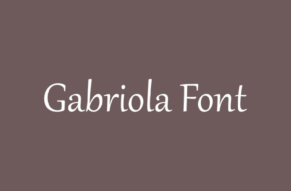
Gabriola Font feels like handwriting done by a skilled artist. It has smooth curves, long strokes, and a gentle rhythm that catches the eye at once. When we first tested this graceful typeface in headings and quotes, it gave every line a soft, poetic energy and a calm voice.
In our review work at Dafontvault, we look for letterforms that balance style and clarity. Gabriola Font stood out because it looks expressive yet still easy to read. It works well when you want words to feel personal and special, but not messy. For that reason, it suits projects that need warmth and elegance.
Font Style & Design Analysis
Gabriola Font is a script-style typeface with a clear calligraphic touch. It is best known as a Microsoft font, designed by John Hudson for Microsoft. The design draws on classic pen work, but the shapes feel modern enough for today’s digital layouts and on-screen typography.
The letterforms show flowing brush strokes, tall ascenders, and expressive swashes on many characters. Because of this, each word has strong movement and natural flow. The strokes thin and thicken in a smooth way, which adds contrast without making the text feel heavy. It brings a soft, graceful mood to short text and titles.
Spacing in this font family leans a bit loose, which gives the letters room to breathe. That said, the rhythm still feels controlled, so words stay readable, even with decorative forms. The overall font style suggests a personal touch, almost like a neat signature on a special note, rather than a strict or formal script.
Where Can You Use Gabriola Font?
Gabriola Font works best in projects where emotion matters. Think wedding invites, name cards, event posters, and elegant quotes for prints or social media. It also suits beauty brands, boutique logos, and packaging that call for a premium but friendly visual identity with a refined and romantic tone.
Because the strokes are detailed, this display font shines at larger sizes. Use it for headlines, short titles, pull quotes, or short product names. At very small sizes, the fine brush strokes can lose clarity, especially on low-resolution screens. In practice, pair it with a simple sans-serif for body copy to keep reading easy.
Designers can also use this typeface for greeting cards, certificates, book covers for poetry, and crafted labels. It speaks well to audiences who enjoy charm, elegance, and a personal touch in their typography. As a result, Gabriola Font is ideal when you want to leave a soft yet attention-grabbing impression.
Font License
The licence for Gabriola Font can vary based on where you access it. Personal use is often allowed under basic system or free licences, while commercial projects may need extra permission. Always check the official licence terms from the original source before using this typeface in paid client work or branding.


