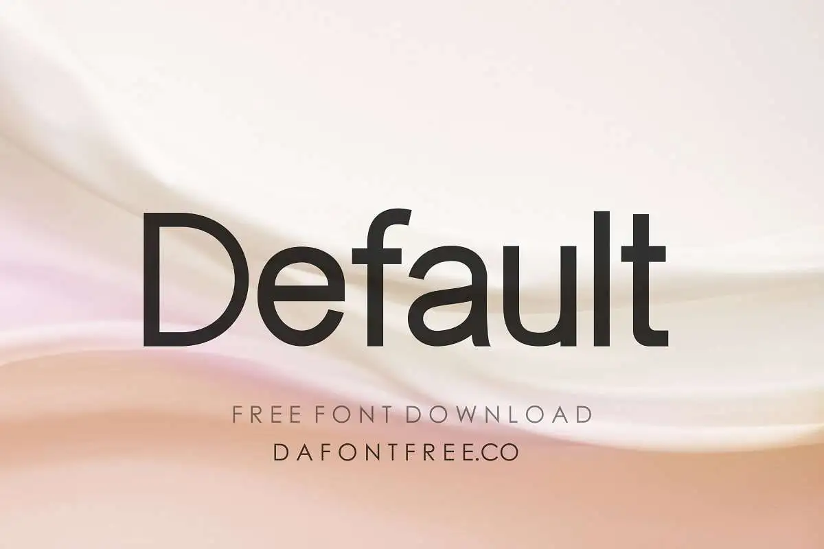
About Default Font
Default Font looks simple at first, but it has a calm, modern charm when we see it in real layouts. We tested it in headings, short notes, and light branding work. Because of this, we noticed how steady it feels on screen and in print, even in quick mock-ups.
The font stood out for us because its letters stay clear in many settings, without feeling cold or stiff. It supports clean visual identity work and everyday design tasks. Here at Dafontvault, we see it as a quiet helper typeface that lets colours, images, and layout choices shine around it.
Font Style & Design Analysis
We read Default Font as a simple sans-serif style display font, aimed at short text, labels, and clear headings. The designer is unknown, but the idea feels very practical. In practice, it keeps to clean lines and gentle forms, so it does not fight with other elements in your design.
The overall typography mood is neutral and modern, with even rhythm from letter to letter. Spacing stays open, which helps legibility on bright screens and darker backgrounds. Because of this, the typeface works well in minimal layouts where you want information to be easy to scan at a glance.
The letterforms show low contrast and a friendly, balanced width. This gives a solid base for UI labels, menus, and simple branding. It does not shout, but it still carries a quiet, bold presence in headings and short titles. As a result, the font style supports flexible design choices across many projects.
Where Can You Use Default Font?
Default Font fits best in work where clarity matters more than drama. Think dashboards, simple logos, app menus, or web headers. It also suits posters with strong images, where you just need neat, headline text. The clean lines help brand systems that must look modern and easy to use.
At large sizes, the display font stays steady and neat, so titles and poster text remain attention-grabbing without looking harsh. At smaller sizes, the screen-friendly spacing helps keep words readable on phones and tablets. For that reason, it suits UI work, tooltips, and quick notes inside digital products.
We also see this font family helping education material, workplace guides, and simple leaflets for broad audiences. Younger readers and busy adults both benefit from its clear shapes and tidy rhythm. When you need straightforward typography that supports a calm visual identity, Default Font is a strong, reliable choice.
Font License
Before you use Default Font, always check its licence terms. Many fonts allow free personal use but need a paid or special licence for commercial projects. For any client work, apps, or products you sell, review the official licence carefully to make sure every use stays fully compliant.


