About Constantia Font
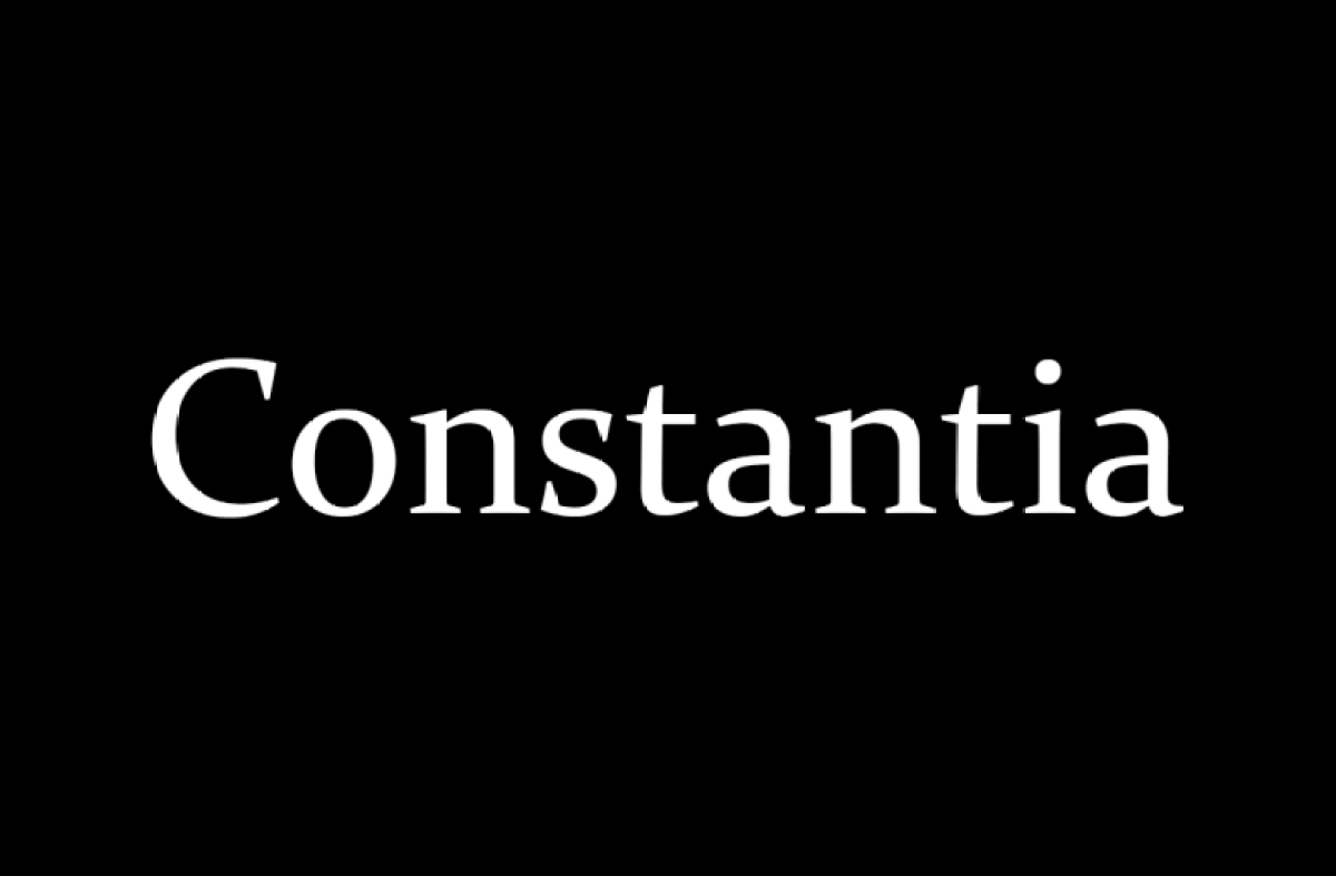
Constantia Font is a calm, book-friendly typeface that many readers know without realising. It first shipped with Microsoft Office, so it has been on millions of screens and pages. When we reviewed it, we found a quiet charm that feels both classic and very easy to read.
In our tests at Dafontvault, this serif font handled long text blocks with ease. Letters stay crisp in print and on screen, even at smaller sizes. Because of this balance of comfort and clarity, it stood out to us as a strong choice for anyone who cares about simple, reliable typography.
Font Style & Design Analysis
Constantia Font is a transitional serif typeface with a soft, human feel. It was designed by John Hudson for Microsoft as part of their ClearType collection. That said, it still looks at home in more traditional editorial layouts, book covers, and printed reports.
The letterforms show gentle contrast between thick and thin strokes, with well-shaped serifs that guide the eye along each line. Curves feel warm rather than stiff, which helps the text flow naturally. As a result, long passages feel less tiring to read, even over many pages of copy.
Spacing and rhythm are handled with care. The font family has clean proportions, steady x-height, and enough breathing room between letters. This gives Constantia Font a sense of heritage without feeling old. The overall mood is calm, trustworthy, and organised, making it ideal for serious content that still needs a friendly tone.
Where Can You Use Constantia Font?
Because of its strong print clarity, Constantia Font works beautifully in books, reports, essays, and study materials. It suits editorial layouts, classic brochures, and simple flyers. If you design for schools, charities, or public bodies, this typeface helps create a stable, approachable visual identity.
On screens, the typeface was tuned for ClearType, so it performs well in PDFs, eBooks, and long-form web articles. It may not be the first choice for flashy headline posters, but it handles subheadings and short text blocks with ease. At small sizes, counters stay open and letters remain distinct.
Branding projects that want a touch of heritage without heavy ornament can also use Constantia Font for secondary text. Think classic letterheads, formal invitations, or professional presentations. Audiences who value clarity, tradition, and careful typography will respond well to its modest, confident font style.
Font License
Constantia Font usually comes bundled with Microsoft products, which affects how you may use it. Personal use inside documents is often allowed, but commercial use or embedding in products can have extra limits. Always review the official licence and terms from the owner before using it in any paid project.


