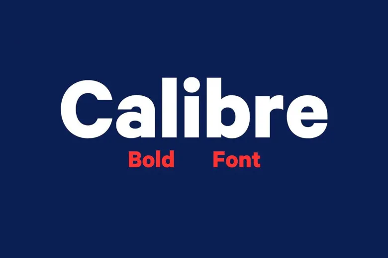
About Calibre Font
Calibre Font is a smart, modern sans-serif typeface that many designers love for its quiet confidence. When we first tested it in real layouts, it felt calm yet strong. The letters sit with easy balance, so text looks organised without feeling stiff or cold.
During our review work at Dafontvault, we noticed how quickly it blended into different layouts. It never shouts, but it always looks clear. Because of this, it stood out as a flexible choice for everyday design, from bold headlines to neat, simple body text in digital and print projects.
Font Style & Design Analysis
Calibre Font is a clean sans-serif typeface with a subtle grotesque flavour. It focuses on clean lines and strong legibility, which gives it a very modern look. The overall style feels minimal and neutral, making it a great foundation for many different visual voices and branding styles.
The design comes from the respected foundry Klim Type Foundry, led by type designer Kris Sowersby. His work often blends craft and function, and we can see that here. The shapes feel carefully drawn, with smooth curves and gentle angles that create a steady rhythm across words and paragraphs.
When we study the spacing and proportions, the typeface shows tidy, even letterforms with room to breathe. The counters are open, so words stay clear on screens and in print. That said, there is enough character in the curves and terminals to avoid a dull, generic mood. The font family feels both practical and quietly stylish.
Where Can You Use Calibre Font?
Because of its clarity, Calibre Font works beautifully in UI and web design. Navigation labels, buttons, and small captions stay readable on phones and tablets. At the same time, its modern personality supports clean branding, from logos to taglines, without stealing attention from photos or product shots.
In print, the typeface handles long text blocks, short pull quotes, and sharp headings with ease. It scales well from small footnotes to large posters. For that reason, it suits corporate reports, brochures, magazines, and simple book interiors where screen-friendly clarity and print reliability must live side by side.
We also like using this font family for minimal visual identity systems, tech brands, and start-up pitch decks. It helps teams who want a modern, professional tone without heavy decoration. Designers working on apps, clean product packaging, and calm lifestyle brands can all benefit from its balanced, trustworthy font style.
Font License
Calibre Font usually needs a proper licence for both personal and commercial projects. Terms can change over time, so always check the official source or foundry for the latest licence details. Before using it in client work, large branding, or apps, confirm that your licence fully covers that use.


