About Bank Gothic Font
Bank Gothic Font feels like a trip into a sharp, techy future. We see it on sci-fi titles, game covers, and bold screens that need a clear, strong voice. When we tested it in mock posters and logos, it kept a steady sense of power without feeling too heavy or dark.
What made it stand out for us was the mix of geometric order and a cool tech vibe. The squared shapes look digital and precise, yet still easy to read at a glance. Here at Dafontvault, we found it ideal whenever a design needs authority, structure, and a hint of sci-fi drama.
Font Style & Design Analysis
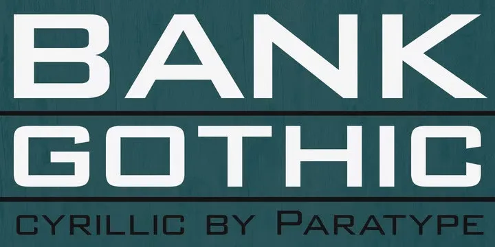
Bank Gothic Font is a sans-serif, square-shaped display typeface with a clear futuristic tone. It was originally designed by Morris Fuller Benton for American Type Founders, and many later digital versions keep that same angular personality. The style feels modern, compact, and ready for bold, high-impact headings.
Its letterforms use straight lines and tight curves to create clean lines with almost no soft edges. Because of this, every character looks engineered rather than drawn. The overall rhythm stays even across a word, which makes long titles and short phrases feel controlled, balanced, and highly intentional in layout.
Spacing in Bank Gothic Font is on the tighter side, which boosts impact in headlines and short text. The mood leans towards sci-fi titles, tech products, and security or industrial themes. That said, with careful tracking, it can sit well in UI labels or screen-friendly banners where a strong, digital voice is needed.
Where Can You Use Bank Gothic Font?
Bank Gothic Font shines in headline work where impact matters more than long reading. Think posters, game covers, film titles, and product packaging with a tech vibe. It also works well in branding for electronics, security firms, and digital tools that want a confident, engineered visual identity.
At large sizes, the angular forms feel attention-grabbing and bold, ideal for short titles and logo wordmarks. In practice, smaller sizes can become cramped if spacing stays too tight. A bit of extra letter spacing helps when you use it in UI labels, navigation menus, or slim web banners that rely on quick legibility.
We like pairing this typeface with a softer sans-serif or a simple serif body font for contrast. It suits audiences who enjoy sci-fi, gaming, tech gear, and modern hardware. For that reason, it fits posters, launch graphics, and display font roles where the goal is to look digital, futuristic, and visually strong.
Font License
Licensing for Bank Gothic Font can change between different digital releases and foundries. Personal use is often less strict, while commercial projects usually need a paid licence. Always check the official licence details from the specific vendor before using it in client work or large branding projects.


