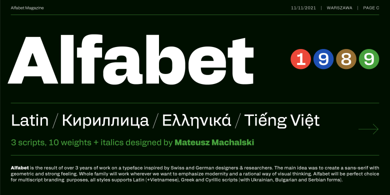
About Alfabet Font
Alfabet Font feels like a fresh take on simple letterforms. It keeps things neat, bold, and easy to read, which gives it a strong modern edge. When we first tested it in a few mock layouts, the shapes held their own, even next to busy images and bright colours.
What stood out most was the balance between friendly curves and clear structure. Each character looks tidy, but never cold. Because of this, the typeface works well in bold headings, short taglines, and simple branding ideas. In our Dafontvault reviews, we saw how quickly it builds a clean visual identity.
Font Style & Design Analysis
We read Alfabet Font as a sans-serif display typeface with a focus on clear geometry. The designer is currently unknown, but the choices suggest a strong eye for clean lines and rhythm. It feels modern without trying too hard, which makes it very flexible for everyday design work.
The letterforms lean on straight strokes and gentle curves, giving each glyph a confident, minimal structure. Spacing between characters feels even and calm, so words sit nicely in a line. This smooth flow means your eye moves easily from left to right, which helps legibility in headlines and short text blocks.
There is a bold presence in uppercase, ideal for a headline or poster title that needs quick impact. Lowercase stays compact and tidy, which suits UI labels and simple branding systems. Overall, the font style carries a screen-friendly feel, good contrast, and a reliable, modern mood.
Where Can You Use Alfabet Font?
Alfabet Font works best where you need strong, simple words to stand out fast. Think product branding, packaging tags, or social media graphics with short titles. Because of its modern, minimal look, it also suits tech brands, digital services, and clean lifestyle projects that want clear typography.
At large sizes, this display font has real impact on posters and banners. The clean lines keep each letter sharp, even against bright photos or textured backgrounds. That said, the typeface also holds up well in mid-sized UI headings, app menus, and web hero text, where legibility and clarity matter most.
For younger audiences, it can feel friendly and direct, especially in educational graphics or kids’ projects that need simple, bold words. For grown-up users, it gives a neat, professional tone in pitch decks, minimal brochures, or branded slide templates. Use it for short text, titles, and key phrases that must be attention-grabbing.
Font License
Before you use Alfabet Font, always check the licence terms from the original source. Many fonts allow free personal use but require a paid or special licence for commercial projects. For that reason, review the official licence carefully so your branding, client work, or products stay fully compliant.


