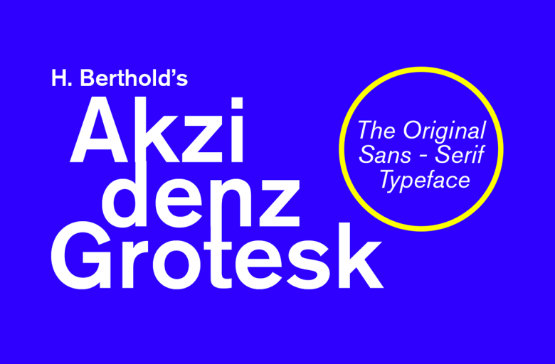
About Akzidenz Grotesk Font
Akzidenz Grotesk Font is one of those quiet legends in typography. At first glance it feels simple, yet it has a strong voice. When we tested it across mock brand layouts and clean UI screens, it held together with calm confidence and never fought for attention.
What stood out for us was its balance. The shapes feel solid, but not cold. Because of this, it works for modern brands that want trust without fuss. Here at Dafontvault, we see it as a reliable backbone typeface that supports bold graphic choices around it.
Font Style & Design Analysis
Akzidenz Grotesk Font is a classic sans-serif grotesque typeface with clean lines and a very practical mood. It comes from the historic foundry Berthold Type Foundry in Berlin, which helped shape modern European typography. That heritage shows in the way the letters feel both neutral and very usable.
The letterforms have a steady rhythm, with open counters and modest stroke contrast, so text blocks feel even and calm. Spacing is generous enough for screen-friendly reading, but still tight enough to keep a modern character. In practice, this makes long passages feel tidy while short headings stay crisp.
We notice how the font family handles weight shifts smoothly, from lighter styles to strong bold cuts. This gives designers a flexible tool for hierarchy. The overall mood is minimal and grounded, which suits clear branding, UI systems, and any layout where legibility must stay high at all times.
Where Can You Use Akzidenz Grotesk Font?
Akzidenz Grotesk Font fits many roles, from serious branding to clean web design. It works well in logos, packaging, and corporate layouts that need modern clarity. For that reason, it often appears in visual identity systems where consistency matters across print, digital, and simple UI components.
At small sizes, the open shapes keep text sharp in manuals, brochures, and interface labels. On screens, its screen-friendly forms hold legibility even in compact menus and button text. At larger sizes, titles and subheads gain a quiet impact without turning into a shouty display font.
Designers can safely use this typeface for editorial-style layouts, minimalist posters, and product sheets aimed at professional or tech-savvy audiences. It also supports calm, premium-feeling layouts for beauty brands or lifestyle projects when paired with generous white space and careful colour choices.
Font License
The licence for Akzidenz Grotesk Font can differ between vendors. Personal use and commercial projects often require separate permissions. Always check the official licence text from the rights holder or distributor before using it in paid client work, apps, products for sale, or wide branding campaigns.


