About Agrandir Font
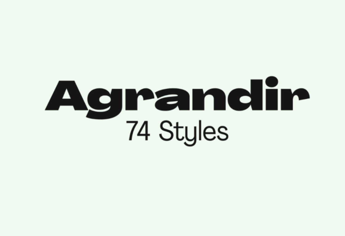
Agrandir Font feels like a fresh breath of air in modern typography. When we first tested it across simple layouts, it gave every word extra clarity and confidence. The letters look open and bright, which makes short text feel bold without shouting at the reader all the time.
During our review work at Dafontvault, this typeface stood out because of its simple shapes and calm rhythm. It keeps a modern tone but still has warmth, so it never feels cold or dull. Because of this balance, it quickly became a go-to choice in our studio for clean, flexible design tests.
Font Style & Design Analysis
Agrandir Font is a sans-serif typeface with a clear geometric edge. It leans toward clean lines and a very modern voice, which makes it ideal for branding and digital layouts. The shapes stay simple, but they still feel human. The designer is often linked to the creative studio Pangram Pangram, known for crisp, screen-friendly fonts.
The letterforms show even strokes and generous counters, so text feels open and easy to scan. Spacing sits on the looser side, which adds great legibility on both desktop and mobile screens. That said, the font still keeps a tight visual structure, so words line up with a steady rhythm in longer headings.
There is a strong sense of minimal control in each character. Rounded details soften the geometric forms, while straight stems hold everything in place. As a result, the overall mood is modern, honest, and functional, with just enough personality to stand out in a busy UI or a clean, minimal poster.
Where Can You Use Agrandir Font?
Agrandir Font works beautifully in brand systems that need clarity and confidence. Use it for logos, wordmarks, and taglines where a modern, minimal feel is key. It also fits well in editorial-style layouts, from online magazines to clean presentation decks, where structure and legibility really matter.
On screens, this font family handles UI elements with ease. Navigation labels, buttons, and app headings stay sharp and easy to read, even at smaller sizes. For larger pieces, like hero titles or bold homepage messaging, its clean lines deliver a strong, polished impact without feeling heavy or overdesigned.
In print, the typeface suits brochures, posters, and simple packaging that lean on modern branding. Tech brands, startups, and lifestyle labels can all benefit from its straightforward voice. Because of its screen-friendly nature, it also bridges web and print smoothly, helping teams keep a consistent visual identity across every touchpoint.
Font License
Licensing for Agrandir Font can change depending on the source. Personal use is often free or low-cost, while commercial projects usually need a paid licence. Always read the official licence terms from the original provider before using the typeface in client work, products, or large-scale branding.


