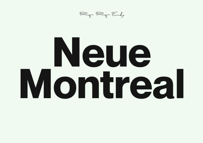
About Neue Montreal Font
Neue Montreal Font feels like a love letter to modern Swiss-style typography. When we first tested it in real layouts, it stood out at once. The shapes looked calm, but also strong. Because of this balance, it quickly became a go-to choice in our studio tests.
We tried it across mock posters, logos, and app screens and it kept the same clear voice. The typeface stayed steady, even when we mixed sizes and weights. At Dafontvault, we noticed how its simple letterforms gave designs a quiet confidence, instead of shouting for attention.
Font Style & Design Analysis
Neue Montreal Font is a contemporary sans-serif typeface with clean lines and a clear, modern tone. It draws from classic grotesque traditions but feels friendlier and more screen-friendly. The font family offers flexible styles that fit both branding work and UI layouts without looking cold or mechanical.
The design is widely linked to Mathieu Desjardins and the foundry Pangram Pangram, known for sharp, modern typography. That said, different digital releases may vary, so details can shift slightly from source to source. Overall, the intent stays the same: a practical, highly legible workhorse.
When we look closely at the letterforms, the rhythm feels even and relaxed. Counters are open, strokes are balanced, and spacing feels carefully tuned for both print and screens. As a result, text blocks are easy to read, while titles still carry a minimal, high-end mood. The overall design feels neutral, yet subtly stylish.
Where Can You Use Neue Montreal Font?
Neue Montreal Font works beautifully in branding systems that need a modern, refined look. We like it for logos, stationery, and packaging where legibility and clean spacing really matter. It suits beauty brands, fashion labels, and thoughtful lifestyle products that want a premium but approachable visual identity.
On screens, this typeface shines in UI design and websites. The clean lines make buttons, menus, and captions easy to scan. At small sizes, it stays clear and readable, which helps with accessibility. At larger sizes, such as section headers or hero titles, it gains more personality without losing its minimal structure.
For print, we recommend it for posters, brochures, and editorial layouts that lean towards modern typography. It pairs well with a serif for body copy, or it can stand alone for short text and headings. Because of its calm tone, it speaks to audiences who appreciate subtle design over loud, attention-grabbing tricks.
Font License
The licence for Neue Montreal Font usually differs for personal and commercial use. Personal projects may be allowed under a free or limited licence, while client work, apps, or large branding jobs often need a paid commercial licence. Always check the official licence terms from the original source before using it in any commercial project.


