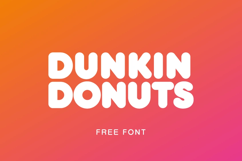
About Dunkin Donuts Font
The Dunkin Donuts Font is one of those typefaces you recognise before you even read the words. Its chunky shapes and bright mood feel just like a fresh box of doughnuts. When we first studied it, the bold presence and friendly charm stood out right away.
We looked closely at how the letters behave in real layouts, from mock shop signs to social posts. The font keeps strong impact even in simple designs, which makes it ideal for quick branding ideas. Because of this, it became a fun case study for us at Dafontvault and a great example of playful brand typography done right.
Font Style & Design Analysis
The Dunkin Donuts Font works as a strong display font, built for headline use and short text. It is rounded, thick, and highly legible, with clean shapes that feel very approachable. This kind of typeface is made to grab attention on posters, shop fronts, and packaging, rather than long reading pages.
The exact font used in the official branding is closely linked to Frankfurter, a classic display typeface designed by Bob Newman for the foundry ITC (International Typeface Corporation). That said, the brand wordmark also uses custom tweaks, so the full logo lettering works like a tailored font family just for the company.
Visually, the letters have soft curves, even weight, and gentle spacing, which together create a warm, friendly mood. The rhythm between each character feels bouncy, almost like the letters are smiling. In practice, this gives any layout a playful tone while still keeping clear, strong titles that stand out across busy backgrounds.
Where Can You Use Dunkin Donuts Font?
The Dunkin Donuts Font style fits any project that needs fun, energy, and instant impact. Think food branding, pop-up shop signage, kids’ projects, or bright YouTube thumbnails. Because of its attention-grabbing shapes, it shines in logos, packaging mockups, and big headline text on colourful posters.
At large sizes, the rounded letterforms really show their character and create strong impact. On smaller labels or social icons, the simple shapes still hold good legibility, as long as you keep words short. For that reason, it works best for titles, badges, and stickers rather than dense blocks of copy.
Designers who want a friendly visual identity can pair this typeface with a clean sans-serif for body text. The mix gives balance between playful titles and easy reading. As a result, it suits cafés, dessert brands, events, and any project that aims for a bold, welcoming voice that feels modern and approachable.
Font License
Like most commercial fonts, usage of any style related to the Dunkin Donuts Font will depend on its licence. Personal projects often have different terms from business work. Always check the official licence from the font’s publisher or foundry before using it in paid, client, or large-scale commercial projects.


