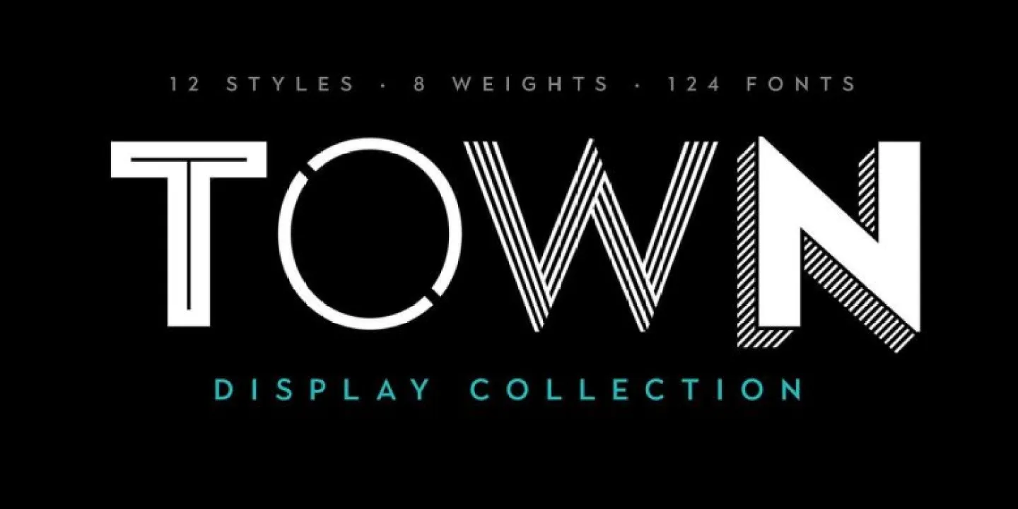
About Town Font
Town Font feels like walking down a busy high street at night, with bright signs and bold letters calling for your attention. When we first tested this display typeface, its strong shapes and clear rhythm made it stand out straight away in our layouts and mock-ups.
We tried it in posters, banners, and short headlines and saw how quickly it grabbed the eye. Because of this, it earned a place in our font toolbox for bold presence and quick impact. On Dafontvault, we often look for type that balances character with control, and this font does that very well.
Font Style & Design Analysis
Town Font works mainly as a display font, built for headlines, short text, and strong titles. Its designer is unknown, but the voice of the typeface is clear and confident. The shapes feel modern, and the letters sit together with clean spacing that keeps each word solid and easy to read.
The letterforms show a mix of straight lines and soft corners, so it does not feel too harsh. This balance gives it a friendly but firm mood. In practice, the rhythm across a line feels steady, which helps when you set big words on posters or banners that need attention-grabbing impact.
Weight and width look tuned for visual punch rather than long reading. Strokes stay thick and consistent, so every character carries strong impact even at a glance. That said, enough breathing room sits inside the shapes, which stops the typeface from feeling cramped, even when you push the size for bold headline work.
Where Can You Use Town Font?
Town Font suits projects where you need clear titles and strong statements. Think music posters, event flyers, bold magazine covers, and social media graphics. For that reason, it fits brands that want a confident, urban visual identity with short, sharp lines of text that jump off the page or screen.
On large formats like billboards and digital banners, the font style keeps its power. The letters look stable and easy to catch from far away. At smaller sizes, it still works for short labels or UI tags, but we would not use it for long paragraphs. It shines most when the words stay brief and loud.
Creative teams can use this typeface for logos, product packaging, and campaign titles aimed at teens and young adults. Because of its headline-friendly design and bold presence, it also fits sports graphics, streetwear branding, and attention-grabbing callouts in web layouts where you want instant focus.
Font License
The licence for Town Font can differ between sources, so always read the official terms. Many fonts allow free personal use but need a paid or special licence for commercial projects. Before you use it for client work, products, or branding, check the current licence details from the original provider.


