About Druk Font
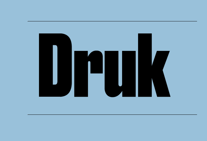
Druk Font is one of those typefaces you notice straight away. It hits the page with huge impact and a bold presence. The letters feel heavy, tight, and confident, which makes every word look important and direct. Nothing about it feels shy or quiet.
When we looked closely at this display font for our own layout tests, it stood out for its strong personality and flexible weight range. Headlines felt powerful, yet still controlled. Because of this, designers can shape very different moods while keeping a clear, unified visual identity across posters, covers, and digital banners.
Font Style & Design Analysis
Druk Font is a pure display typeface with a strong, condensed structure. It comes from the respected foundry Commercial Type, known for modern, editorial fonts that work hard in tight spaces. In practice, Druk focuses on short text and big sizes where impact matters most.
The letterforms use tall verticals and narrow widths, so words stack neatly in tight columns. Strokes feel thick and firm, with almost no softness at the edges. This creates a loud, attention-grabbing voice that owns any headline. That said, it still keeps clean lines, so shapes stay clear on both print and screen.
Spacing is intentionally tight, giving each line a dense, powerful rhythm. There is little air between characters, which adds pressure and energy to every title. As a result, the mood leans serious and assertive rather than playful. Designers can push scale very high and still enjoy strong legibility in posters and bold branding work.
Where Can You Use Druk Font?
Druk Font works best where you need maximum impact in very few words. Think bold magazine covers, striking poster layouts, album art, and campaign headlines. Because this display font is so strong, it shines in branding systems that aim for a fearless, urban feel across print and digital touchpoints.
At huge sizes, Druk delivers clear, screen-friendly shapes that hold up on billboards, banners, and home pages. In smaller titles, it still keeps good legibility, but it is less suited to long paragraphs or body text. For that reason, we suggest pairing it with a calmer sans-serif or serif companion in UI or editorial layouts.
Brands aimed at fashion, music, sport, or youth culture gain a lot from its intense, headline-focused style. It suits campaigns that need quick attention and strong message recall. Designers can use it for logos, event titles, and graphic social posts where a bold presence and tight typography help messages hit fast and stay memorable.
Font License
Druk Font usually needs a proper licence for both personal and commercial projects. Terms can change by vendor and usage, such as print runs, web traffic, or apps. Always check the official licence details from the rights holder before using it in any paid client work or large-scale campaign.


