About Jeopardy Font
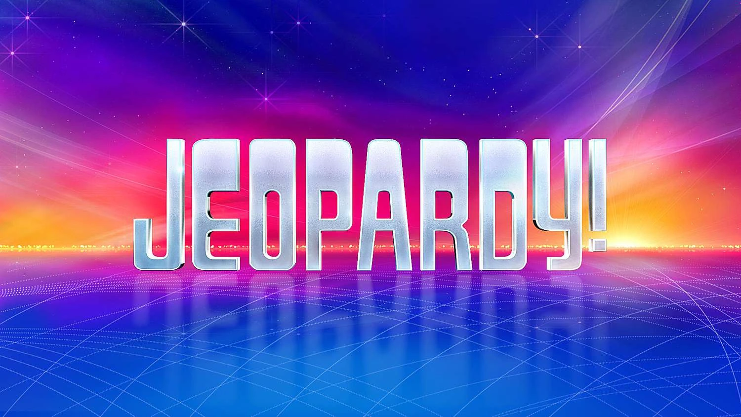
Jeopardy Font is one of those bold title styles that you recognise at once, even from far away. It has a strong game show feel, with bright energy and a sense of drama that jumps off the screen. We looked at it closely to see why it stays so memorable.
During our review, we studied how its shapes hold up in modern typography and digital layouts. The font stood out because of its confident rhythm and playful tension between letters. On Dafontvault, we love how this typeface brings instant excitement to any headline or graphic project.
Font Style & Design Analysis
Jeopardy Font sits firmly in the world of bold display font design. It feels built for headline use, TV graphics, and punchy titles rather than long reading text. The exact designer is currently listed as designer unknown, but the style clearly follows classic game show and TV logo traditions.
The letterforms use strong blocks and big shapes to create real impact. The strokes feel thick and confident, giving each character a bold presence on posters or screens. Because of this, the overall mood is lively and slightly dramatic, as if every word is part of a big reveal or quiz moment.
Spacing between letters is fairly tight, which helps the typeface hold together as a solid wordmark. That said, there is still enough room for clear legibility at medium sizes. In practice, this font style shines when used for short text, such as show titles, banners, and attention-grabbing graphic elements.
Where Can You Use Jeopardy Font?
You can use Jeopardy Font wherever you need an exciting, TV-inspired visual identity. It works well on show posters, streaming thumbnails, quiz night flyers, and social media graphics. For that reason, it suits brands and events that want a fun challenge vibe, games, or competition themes.
On large formats, such as banners, stage backdrops, or big web headers, the typeface delivers strong headline energy and attention-grabbing presence. It also holds up at medium sizes in UI cards or section titles, as long as you keep text short. We would avoid using it for long paragraphs or tiny captions.
This typeface can appeal to families, school events, streaming creators, and quiz hosts who want a bold, playful tone. Because of its poster-style design, it pairs nicely with simpler sans-serif fonts for body copy. Together, they create a balanced system that still keeps the game show mood front and centre.
Font License
The licence for Jeopardy Font may differ between sources, so always read the official terms. Many versions allow free personal use, but commercial projects usually need a proper licence. Before using it in client work, branding, or paid media, check the current licence details from the original publisher.


