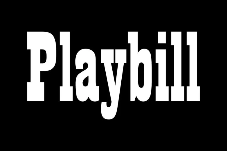
About Playbill Font
Playbill Font feels like a loud voice from an old theatre poster. We see it again and again on bold titles, stage signs, and dramatic layouts. Each letter has a strong shape, so it jumps out at you at once. Because of this, it demands attention fast.
When we review this typeface for design work, we notice how easily it fills space with impact. The tall forms and tight shapes create a rich, vintage poster mood. At Dafontvault, we like how it turns simple words into strong, showtime-style headlines without needing extra effects.
Font Style & Design Analysis
Playbill Font is a classic display font with a bold, theatrical feel. It is best known as part of the Playbill style used in old play posters and circus titles. The exact creator of this digital version is often listed as designer unknown, but the design roots go back to early wood type.
The letterforms are tall, condensed, and strong. The strokes feel heavy and sturdy, giving every word a firm, headline-weight presence. You get a strong vertical rhythm, with letters stacked close together for maximum impact. That makes it great for short text, names, or powerful titles.
There is very little subtle contrast or softness here. Instead, the spacing stays tight, and the shapes create a bold presence across a page or poster. In practice, this typeface brings an attention-grabbing, vintage stage mood that suits dramatic layouts, classic theatre themes, and show-style typography.
Where Can You Use Playbill Font?
Playbill Font works best in big, loud roles. Think event posters, theatre flyers, fairground signs, and bold branding for shows or festivals. It gives a strong visual identity to anything linked to performance, live music, or circus-inspired themes, where you want instant drama and energy.
At large sizes, this typeface shines on posters, banners, and book covers. The thick strokes and condensed shape hold detail even from far away. At very small sizes, though, the tight forms can feel cramped, so we suggest using it for headings, logos, and short titles rather than long reading text.
Designers use it for retro stage graphics, attention-grabbing titles in editorial layouts, and statement headlines on packaging. It also works for themed menus, ticket designs, and seasonal print pieces where a theatrical, period style adds character. Because of this, audiences who love drama, nostalgia, and old-school posters respond well to it.
Font License
The licence for Playbill Font can change depending on the source. Some versions allow free personal use, while commercial projects often need a paid or special licence. For that reason, always check the official licence terms carefully before using this typeface in client work or paid designs.


