About Sesame Street Font
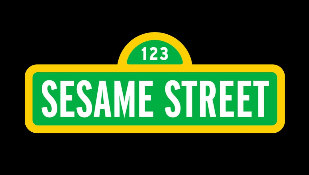
The Sesame Street Font feels like a warm trip back to childhood. Its rounded shapes and friendly mood echo the spirit of the classic TV show. When we first reviewed this playful typeface, the bold letters and clear outlines instantly caught our eye on colourful mock posters and title cards.
In our tests, the font stayed readable while still feeling fun and loose. It balances energy and clarity, which is rare for a cartoon style. That mix of charm and control makes it stand out for kids’ projects, classroom graphics, and family-friendly branding we explore on Dafontvault.
Font Style & Design Analysis
The Sesame Street Font sits firmly in the cartoon display category. It is a playful typeface with chunky shapes that suit big headlines and short text. The exact designer is unknown, but the letterforms clearly draw inspiration from the famous TV wordmark and its joyful, educational tone.
Each character uses soft curves and rounded corners, which give the font a fun, friendly feel. The strokes stay even, so the rhythm of words looks steady and strong. Because of this, the font style supports clear reading while still holding a bold presence on posters and banners.
The spacing between letters is slightly tight, which helps the words form solid blocks of colour. That said, the overall typography still feels open enough for kids’ projects and stickers. On bright backgrounds, the thick outlines create impact and keep the mood light, making the whole font family perfect for attention-grabbing titles.
Where Can You Use Sesame Street Font?
The Sesame Street Font works best in playful branding, posters, and video thumbnails. Use it for kids’ party invites, school event flyers, classroom labels, or YouTube intros aimed at young viewers. Its rounded, friendly shapes set a positive visual identity that parents and children both trust.
On large sizes, like banners and cover art, the font’s bold letterforms really shine. Headlines pop off the page and grab attention fast. In practice, it is less suited to long paragraphs, but it pairs well with a simple sans-serif for body text. This keeps your layout tidy and screen-friendly.
We also like this display font for apps, educational games, and websites aimed at early learners. The clear forms and playful tone make buttons, badges, and short labels easy to spot. For craft prints, stickers, and colouring sheets, it adds a fun personal touch while staying highly legible for young readers.
Font License
Licences for the Sesame Street Font can differ between sources. Some versions may allow free personal use, while commercial projects usually need a paid or special licence. Always read the official licence details carefully and confirm usage rights before using this typeface in any paid client work or products.


