About Led Zeppelin Font
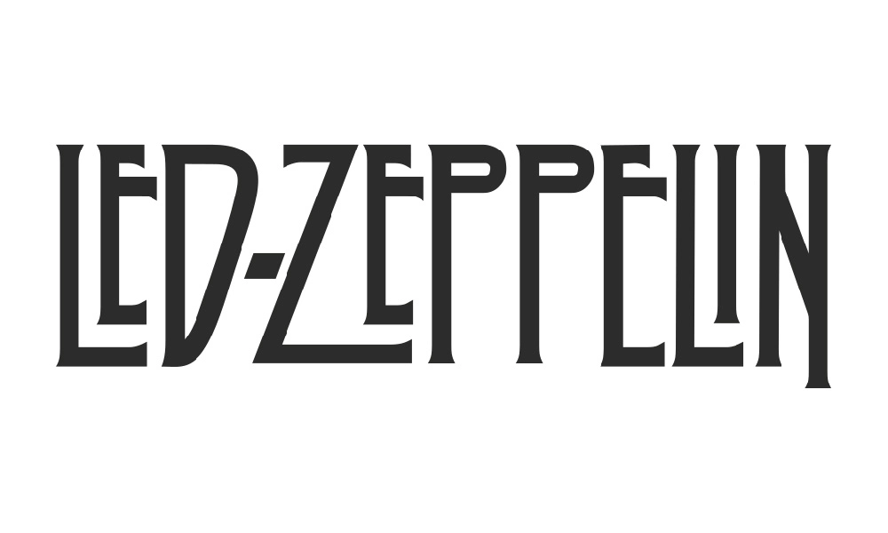
The Led Zeppelin Font feels like a blast of rock history on the page. It echoes the famous logo linked to the legendary band, with tall, dramatic shapes that grab the eye at once. When we first tested it in mock album covers and posters, it brought instant energy and attitude.
As we explored this typeface in more layouts, its bold presence and sharp personality stood out. It works best when you want impact, not silence. On Dafontvault, we look for fonts with a clear voice, and this one speaks in loud, confident lettering that suits music, events, and bold branding work.
Font Style & Design Analysis
The Led Zeppelin Font sits firmly in the display font camp. It is built for headlines, not long reading. The style draws on classic rock poster typography, with a hint of retro flair and dramatic, almost gothic touches. The exact creator of this typeface is often listed as designer unknown, which adds to its cult feel.
Its letterforms are tall and narrow, with strong vertical strokes and tight curves on key characters. This creates a sense of upward movement, like a rising stage light. The rhythm between letters feels compact, so each word becomes a solid graphic block, ideal for short titles and impactful name treatments.
Spacing is close, and the shapes lean into a dramatic, album art mood. Because of this, the typeface can feel intense in all caps, which suits posters, banners, and striking cover designs. Used in the right context, the font style delivers a powerful, attention-grabbing look that reflects rock heritage and bold visual identity.
Where Can You Use Led Zeppelin Font?
The Led Zeppelin Font shines in headline work where you need drama and impact. Think music posters, festival flyers, tribute night graphics, and bold social media titles. It also works for logo-style wordmarks for bands, entertainment brands, and fan projects that lean into nostalgia and classic rock energy.
Because this typeface is a strong display font, it performs best at larger sizes. On small screens or body text, the tight spacing and stylised shapes can reduce legibility. That said, on posters, album mock-ups, video thumbnails, and bold web banners, its dramatic look reads clearly and leaves a lasting impression.
In practice, this font suits audiences who enjoy rock, metal, and vintage music culture. Designers can pair it with a simpler sans-serif font family for supporting text, keeping reading easy while the main titles carry the show. For projects needing album art flair, grainy posters, or retro-inspired branding, it is a powerful choice.
Font License
Licensing for the Led Zeppelin Font can vary between sources. Some versions may allow personal use only, while commercial projects often need a paid or special licence. Always read the official licence details from the provider before using this typeface in client work, products, or any commercial design.


